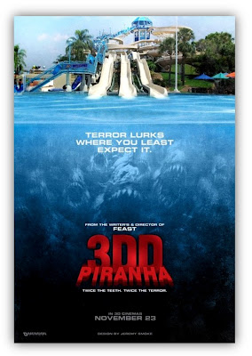
It's actually with a bit of hesitation that I choose the teaser poster for Piranha 3DD as the bring back for TpT. You see, Piranha 3DD is penned by Marcus Dunstan...a man who inspires me more than words can encompass. You may know Dunstan as the man who wrote the Feast films as well as the last four SAW films, and The Collector. You may be saying to yourselves, "Oh, big deal...he wrote some mixed reviewed horror films." Let me be the one to tell you that the fact this man was able to survive living in Macomb, IL (the town my college is located) for his formative years and managed to not only come out alive, but VERY well in a genre I have such passion for...blows my freaking mind. This man proves to me that I will not be leaving this cultural wasteland of a two screen movie theatre completely without any glimmer of hope. Seriously. Macomb sucks. I digress. With all of that being said, I can't be approving of everything Dunstan touches simply because he's a fellow Macombie Homie, that's just unfair. When it comes down to it, this teaser poster isn't necessarily bad...it's just lazy as hell.
I included the poster for Piranha 3D on a Terrible Poster Tuesday once before on the grounds that it was unoriginal. It has sense grown on me and I actually rather enjoy the JAWS homage and the bright colors. However, this poster doesn't do it for me. It doesn't do it for one reason and one reason only...IT'S LAZY. The bottom image of the piranhas in the water is the EXACT same image they used for the original poster. Someone literally cropped out the girl laying on the raft from the original poster and photoshopped in a picture of a kick-ass water slide. It's a sequel poster and I understand it wanting to fit within the same realm as the original, but this is ridiculous. It's literally the same freaking poster from the waist down.
It might be a little bit better if the water slide wasn't so far away and if it didn't look like a photograph. The piranhas are clearly animated/cgi/something and the water slide is clearly resembling an ad cut out of a brochure for a water park. Cutting corners is one thing, blatant disregard for lighting is another. I'm glad that this is simply a teaser poster and I'm VERY excited for the sequel to come out, but this is just a mess in a dress. I may not have to take the movie seriously to enjoy it, but this poster is an eyesore and not exactly something I'd ever want to hang on my wall. Back to the drawing board, boys.

0 comments:
Post a Comment